Our branding project
We built our entire brand using AI — from initial logo sketches and design concepts to the final logo and social media icons. The result is a sleek, cohesive brand identity and mock‑up pack that showcase the power of creativity and artificial intelligence.
Overcoming the “Cold” Stigma: AI branding often falls into the trap of looking robotic, overly technical, or cold (think generic blue circuit boards). The challenge was to make AI feel warm, organic, and accessible to everyone.
The logo uses “additive storytelling” to combine stability with innovation:
Step 1: The Anchor (The ‘A’) Represents the foundation. It stands for “Alpha” and stability, grounding the brand.
Step 2: The Spark (The Asterisk) Represents the magic. The universal symbol for AI, intelligence, and creation. The motor behind the creations, and a subtle wink to Claude.
Step 3: The Fusion Placing the spark inside the anchor illustrates that AI is the heartbeat of the integration.
Step 4: The Identity The final high-contrast silhouette acts as a Hub—a unique portal where stability and creativity converge.
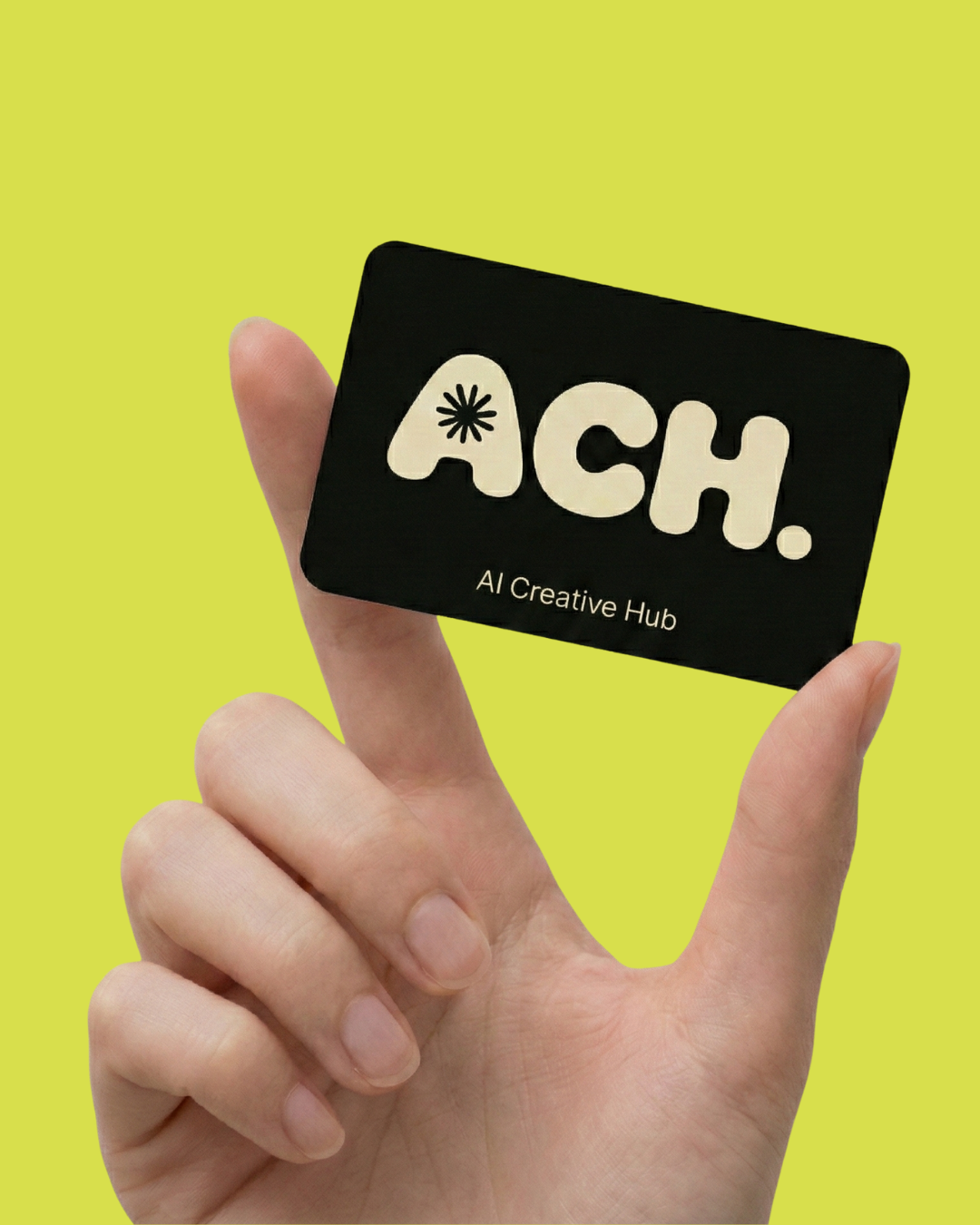
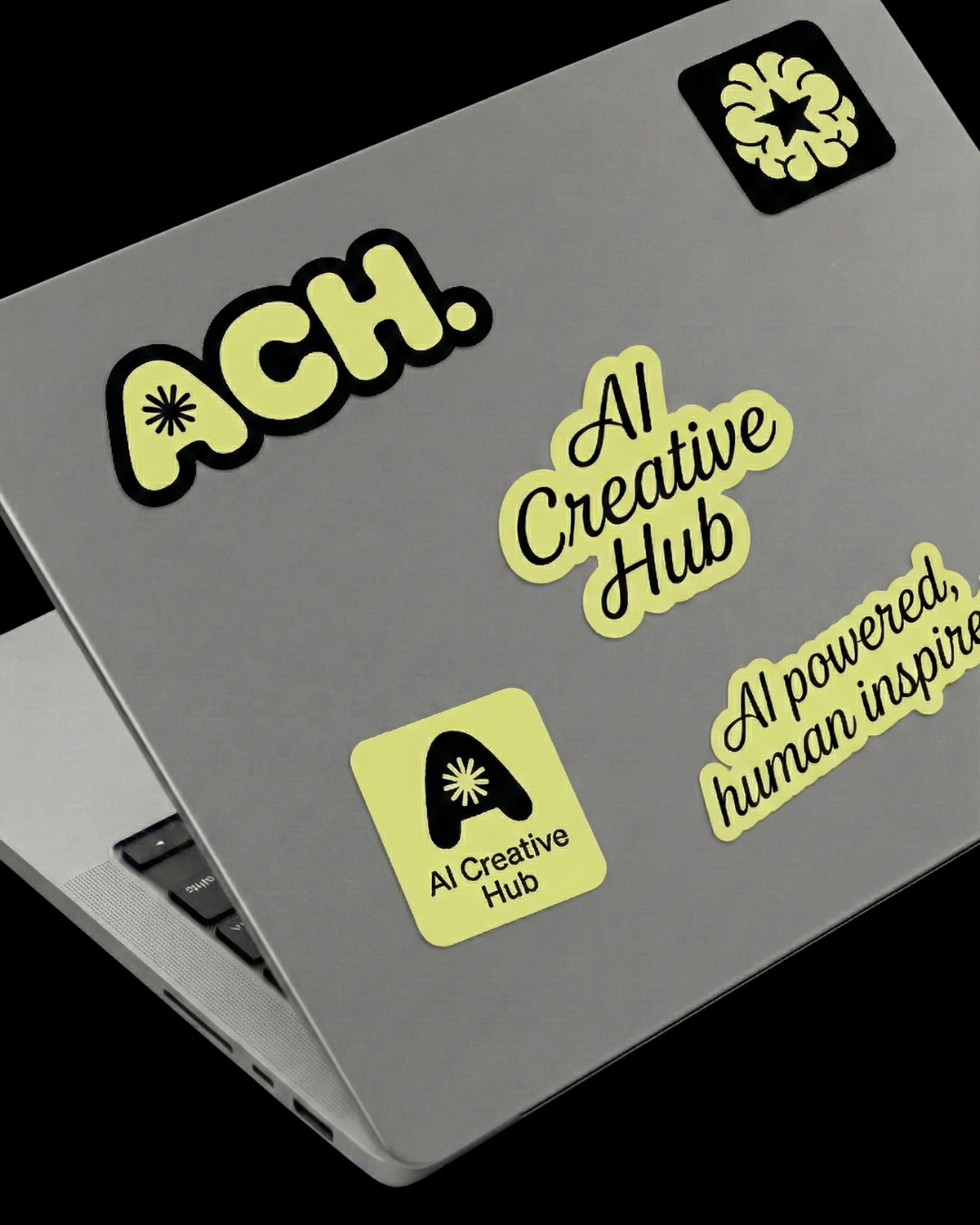
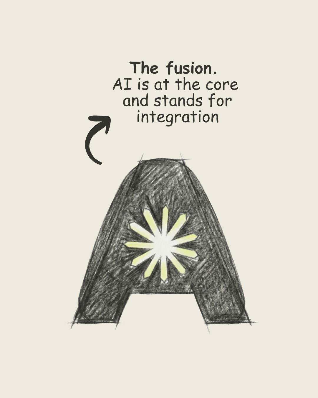
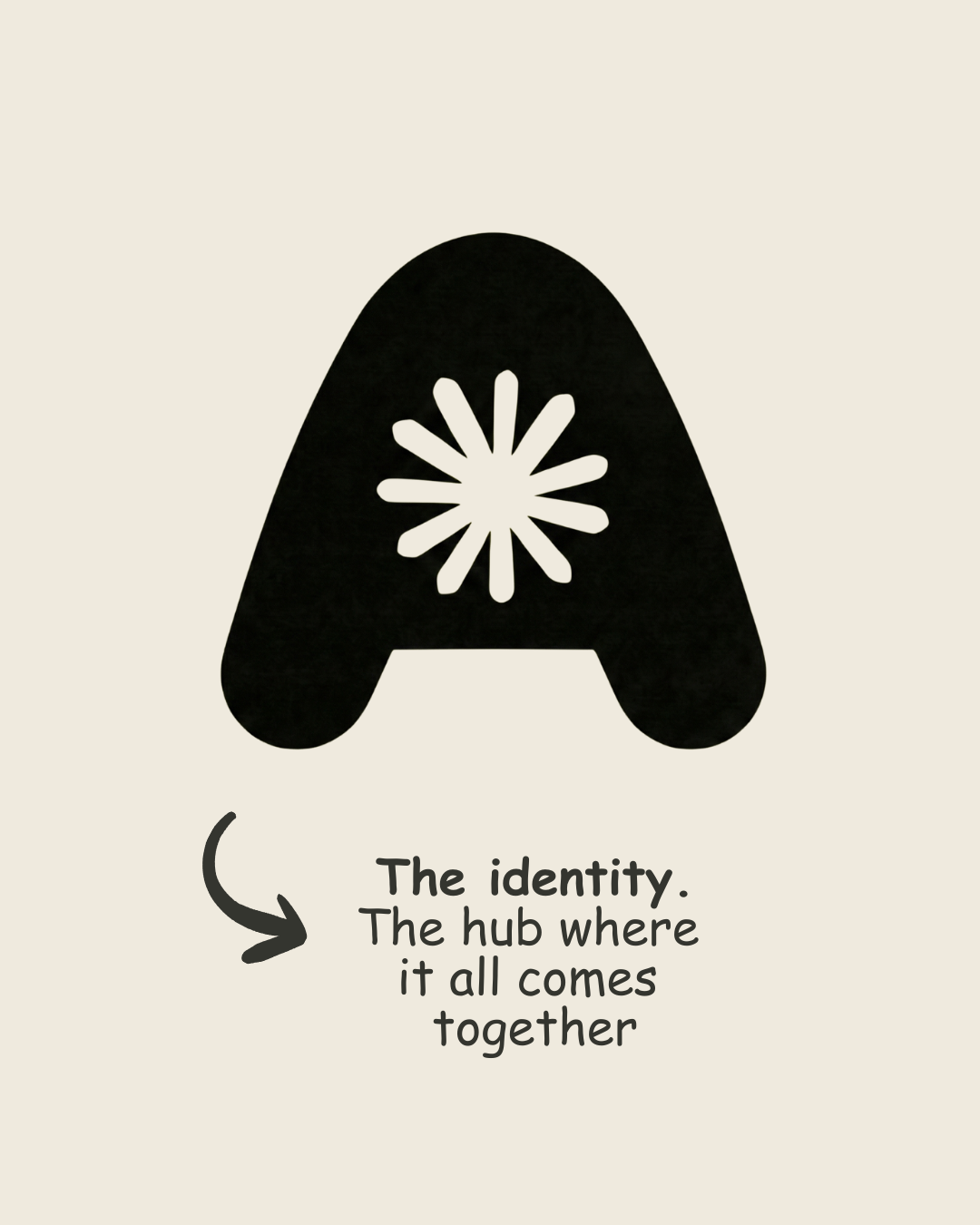
The final result is a brand identity that feels playful, bold, and Gen-Z friendly. By combining energetic lime green with soft cream tones and rounded, bubble-like typography, the design successfully balances digital innovation with human approachability.